Riley_Nilsen
Work
About
ProCon.org
The aim of this project was to work with other bootcamp students in order to improve the usability of a site using the UX design process. We chose ProCon.org because it provides an important service in the current news media climate. It is an Encyclopedia site that provides users with a two sided look at popular and current topics.
Problem
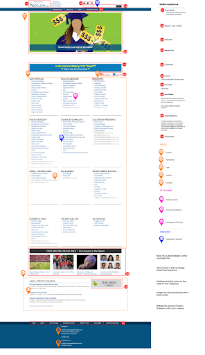
Users that visited ProCon.org were immediately met with confusion and frustration when browsing the site. This was caused by the layout and navigation used on the page. The site does not immediately offer the user a sense of trust and definition as to who ProCon.Org is as an organization.
Process
Research
Sent out surveys to gain a breadth of information about news consumption
Ideate
Conducted a heuristic evaluation to identify major issues with the site
Design
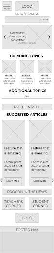
Create design wireframes
Test
Conduct usability on new designs
Research
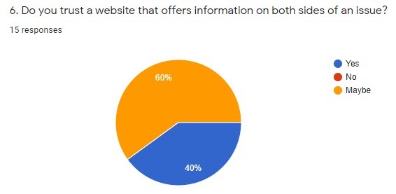
In order to kick off the direction of the design process, we created a survey to gain insight into how users ingest and view modern news. The survey contained questions aimed at outlining the users news consumption habits and how they trust their news sources.
Survey Findings:
- Majority of participants are unsure if you can trust an online source, what is the sites credibility?
- .org, .gov, .edu are important trust factors for an online source
Ideate
To identify current issues with the site, our group conducted a heuristic evaluation. This outlined the major issues to focus on throughout the redesign. Heuristic Evaluation Findings:
- The main issues we found were the credibility of the site not being established as well as an overwhelming amount of topics presented at once and without organization
- LATCH & IA principles were very weak within the site causing the users to use too much effort in order to find their desired topics.
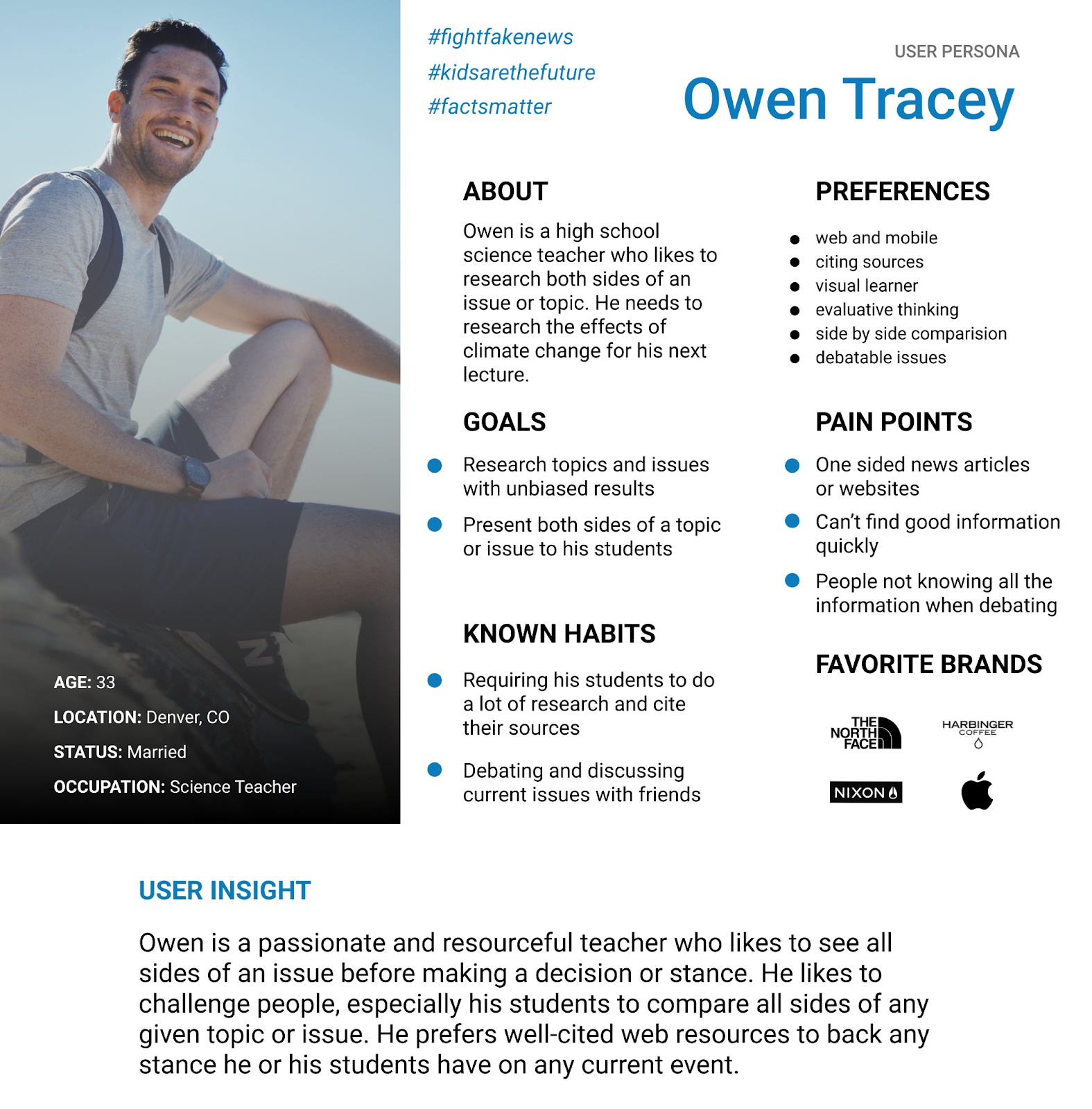
User Persona
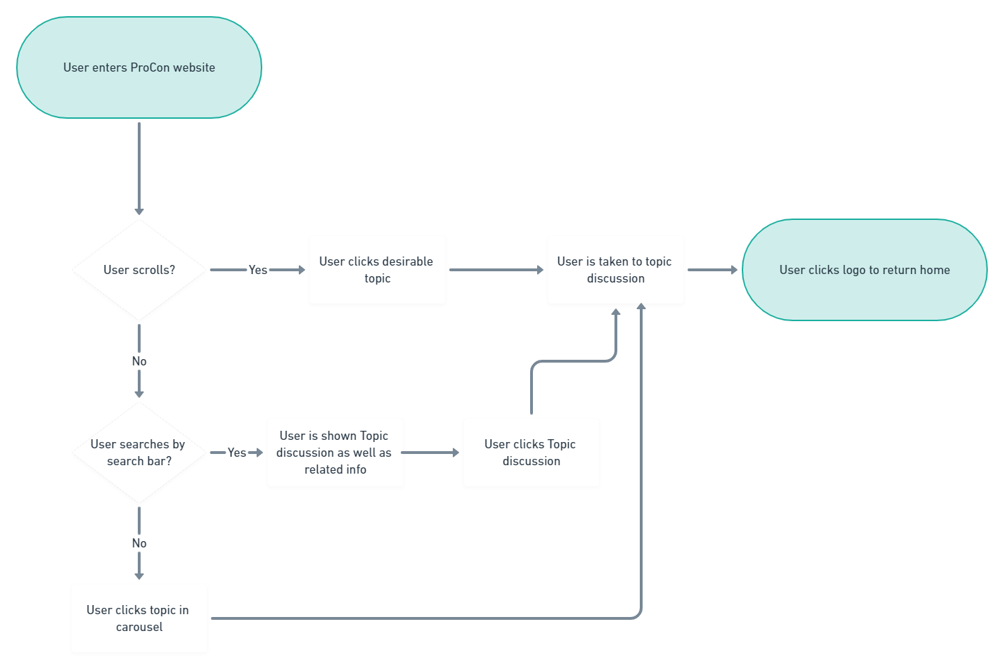
User Flow
Design
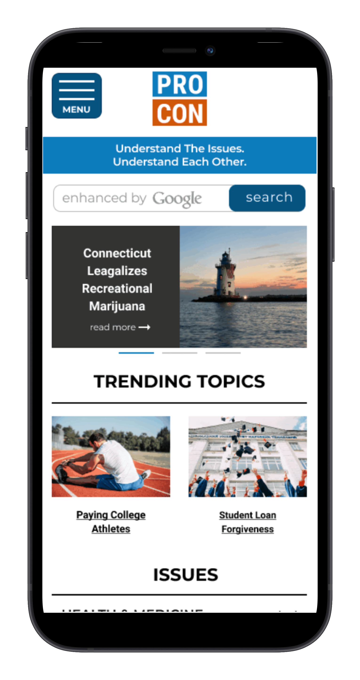
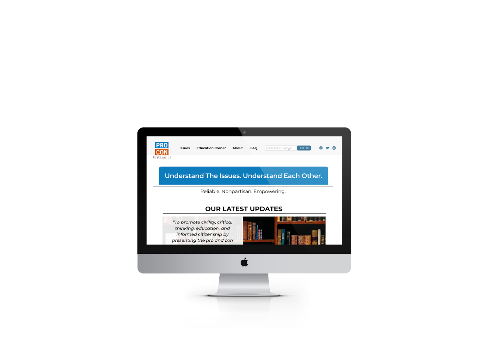
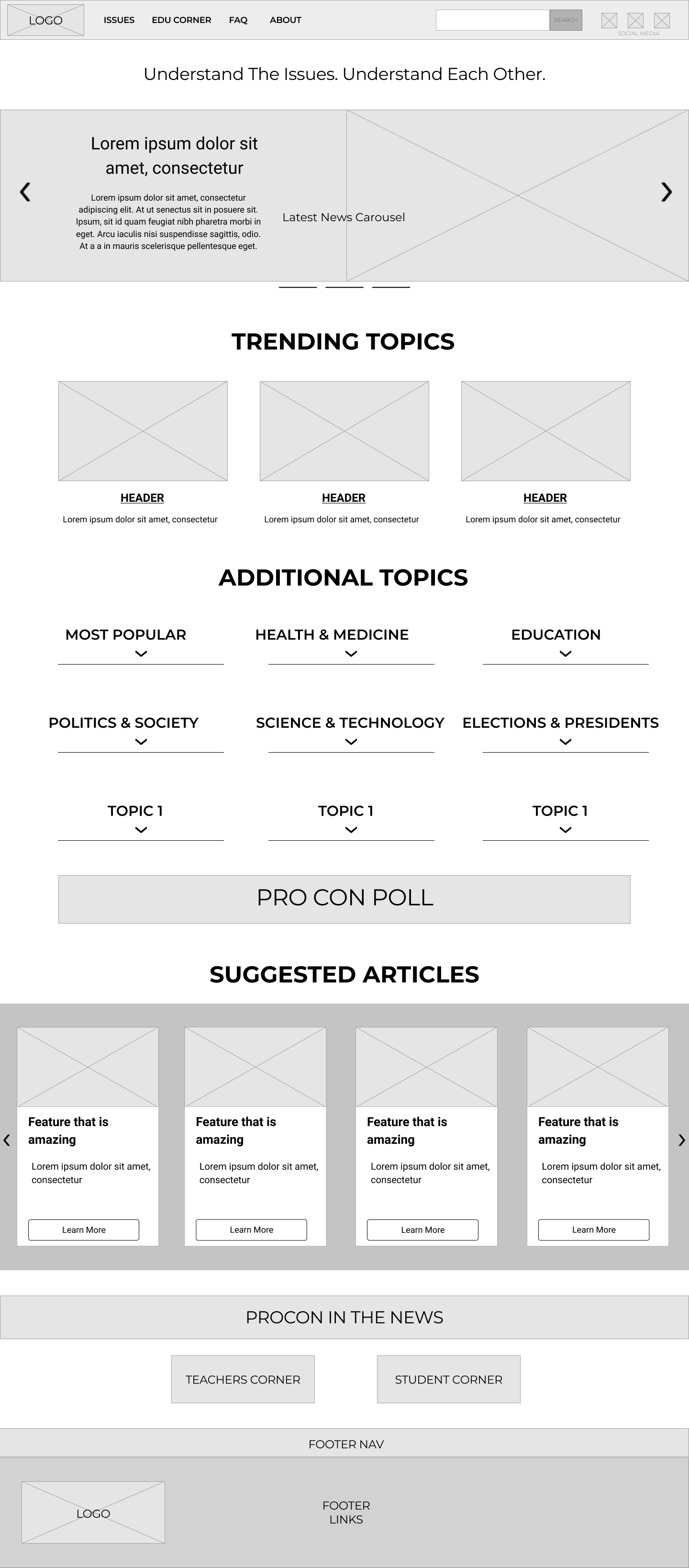
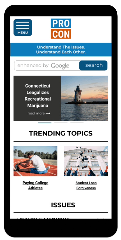
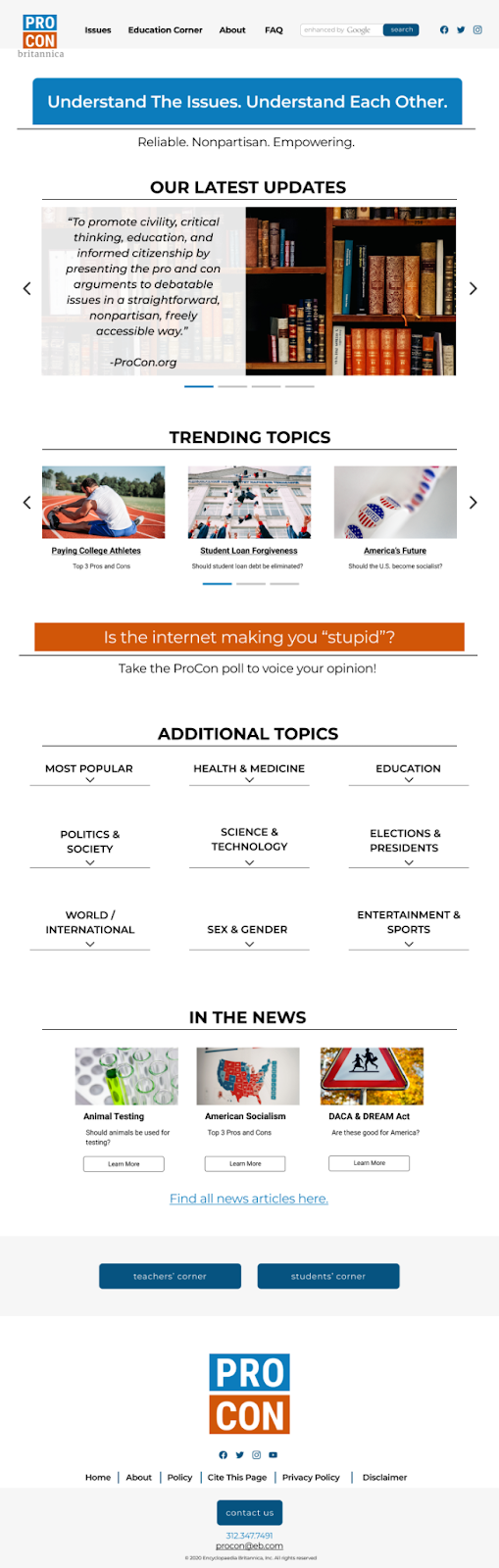
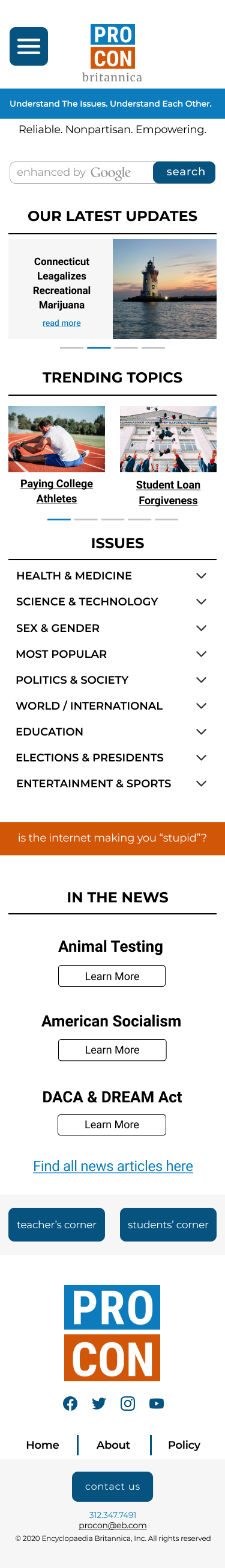
One of the main issues we wanted to address within the redesign was the overwhelming amount of information the users were presented with on the home page of the site. To do this we made a couple of major design decisions and started with a mobile first design approach.
Decisions:
- Improving the IA by hiding the contents of each sub-category until the user clicked into them. This prevents the user from receiving and overload of information
- The Issues tab within the global navigation takes users to the Issues section of the Home Page instead of presenting them with a dropdown. This allows users to the sub-categories rather than forcing them to guess which category to explore
Testing
In order to test our designs we conducted multiple rounds of user testing. These rounds of testing were completed on both our Mid fidelity prototypes and High fidelity prototypes. This gave us a good idea How the users interacted with our designs.
Testing Results:
- 6 MidFi user tests
- 4 HighFi user tests
- 90% success rate
Final Thoughts & Design
- We felt the updates made with our redesign will allow users to feel more confident navigating ProCon and find their desired topic more easily
- Mobile first approach was beneficial for creating the Mid-Fi prototypes but should have used testing to influence Hi-Fi mobile screens instead of basing them off of the Hi-Fi website
- Our design process was extremely beneficial in redesigning the site. Mobile first allowed us to seamlessly switch between Desktop, Tablet, and Mobile
- Conducting more testing would have been beneficial in exploring some variations in our design
- Throughout this redesign process, we believe that we touched the main pain points we initially defined and created a positive improvement overall
Riley_Nilsen
Work
About
ProCon.org
The aim of this project was to work with other bootcamp students in order to improve the usability of a site using the UX design process. We chose ProCon.org because it provides an important service in the current news media climate. It is an Encyclopedia site that provides users with a two sided look at popular and current topics.
Problem
Users that visited ProCon.org were immediately met with confusion and frustration when browsing the site. This was caused by the layout and navigation used on the page. The site does not immediately offer the user a sense of trust and definition as to who ProCon.Org is as an organization.
Process
Research
Sent out surveys to gain a breadth of information about news consumption
Ideate
Conducted a heuristic evaluation to identify major issues with the site
Design
Create design wireframes
Test
Conduct usability on new designs
Research
In order to kick off the direction of the design process, we created a survey to gain insight into how users ingest and view modern news. The survey contained questions aimed at outlining the users news consumption habits and how they trust their news sources.
Survey Findings:
- Majority of participants are unsure if you can trust an online source, what is the sites credibility?
- .org, .gov, .edu are important trust factors for an online source
Ideate
To identify current issues with the site, our group conducted a heuristic evaluation. This outlined the major issues to focus on throughout the redesign. Heuristic Evaluation Findings:
- The main issues we found were the credibility of the site not being established as well as an overwhelming amount of topics presented at once and without organization
- LATCH & IA principles were very weak within the site causing the users to use too much effort in order to find their desired topics.
User Persona
User Flow
Design
One of the main issues we wanted to address within the redesign was the overwhelming amount of information the users were presented with on the home page of the site. To do this we made a couple of major design decisions and started with a mobile first design approach.
Decisions:
- Improving the IA by hiding the contents of each sub-category until the user clicked into them. This prevents the user from receiving and overload of information
- The Issues tab within the global navigation takes users to the Issues section of the Home Page instead of presenting them with a dropdown. This allows users to the sub-categories rather than forcing them to guess which category to explore
Testing
In order to test our designs we conducted multiple rounds of user testing. These rounds of testing were completed on both our Mid fidelity prototypes and High fidelity prototypes. This gave us a good idea How the users interacted with our designs.
Testing Results:
- 6 MidFi user tests
- 4 HighFi user tests
- 90% success rate

Final Thoughts & Design
- We felt the updates made with our redesign will allow users to feel more confident navigating ProCon and find their desired topic more easily
- Mobile first approach was beneficial for creating the Mid-Fi prototypes but should have used testing to influence Hi-Fi mobile screens instead of basing them off of the Hi-Fi website
- Our design process was extremely beneficial in redesigning the site. Mobile first allowed us to seamlessly switch between Desktop, Tablet, and Mobile
- Conducting more testing would have been beneficial in exploring some variations in our design
- Throughout this redesign process, we believe that we touched the main pain points we initially defined and created a positive improvement overall