Riley_Nilsen
Work
About
WTW - ESS Next
Designing to enhance the user's benefits enrollment experience
Overview
WTW provides software solutions within multiple industries, ranging from Risk management & Finance, to HR. My time at WTW was spent designing and improving a Benefits Enrollment software called ESS Next. This product serviced 3.5 million users annually across 80+ fortune 500 clients and was utilized to distribute the benefits each client offered to their employees. This was a white label product designed to encompass all possible benefits offered, allowing clients to choose which features fit their needs. In order to improve this product, I worked collaboratively on a team with 5 other UX designers to address both Stakeholder and Client needs while creating user centered design solutions.
Responsibilities
Visual design
Accessible design
Qualitative research
Evaluative research
Prototyping
Stakeholder relations
Team
4 Stakeholders
2 Project Managers
1 Product Owner
3 Developers
3 Quality Analysts
1 Business Analyst
Tools
Figma
Azure Dev Ops
Userlytics
Design Cycle
To consistently create impactful design solutions, I followed a UX design cycle established by our UX Team. This allowed me to create designs born around the needs of our users and clients, while being as consistently robust as other designs implemented by the rest of the UX team. I used this process for all the projects I completed at WTW, be it large or small.
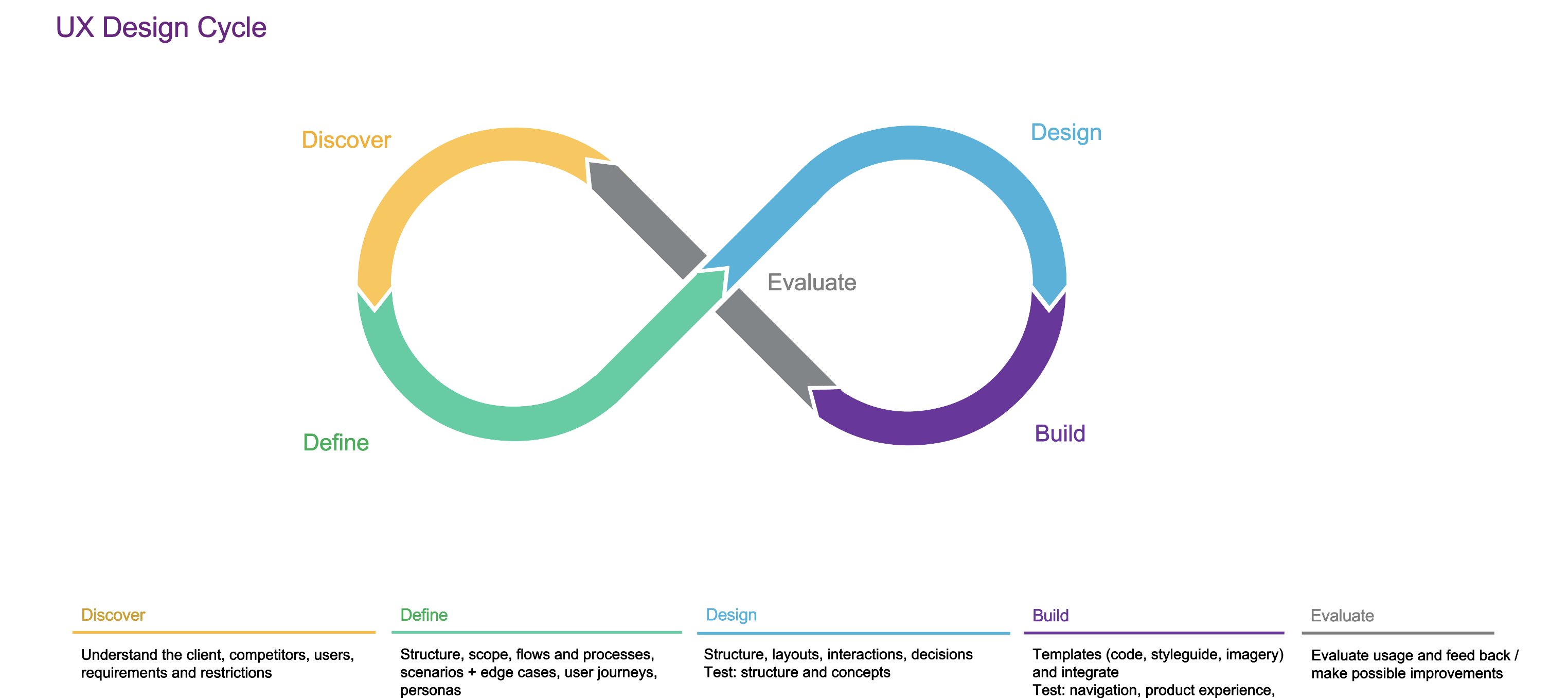
Discover & Define
Discover the requirements and needs of the users. Define scope of the story and how to meet the user's needs.
Design & Build
Design and build a solution using WTW design system. Conduct usability testing to test design solution.
Evaluate
Conduct usability testing on design solution. Present solution and usability testing to UX Team and stakeholders for feedback before implementation.
Provider Search
Our UX Team was working to continuosly improve ESS Next. One major pain point encountered by our users was difficulty in searching for and adding existing providers. This feature was intended to help the user find insurance plans that covered their existing providers to prevent them from paying extra when receiving medical or dental care. Improving this interaction would reduce the amount of users calling the service center and decrease the overall time of enrollment from start to finish.
Discover & Define
Discover
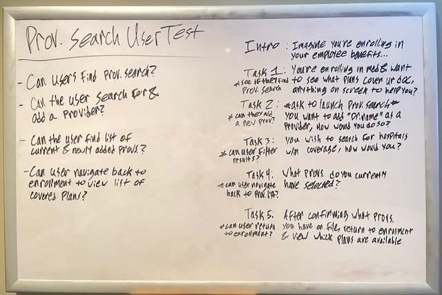
To continuously improve our site in a way meaningful to our users, my UX Team conducted moderated and scripted, qualitative usability testing in partnership with our clients. We would test with 10 - 20 users as they went through their entire benefits enrollment process. This allowed us to sit with real users of our product and gauge whether or not our site was meeting their needs. Results from this qualitative research allowed us to define what user needs still needed to be addressed and prioritized with our product team.
Define
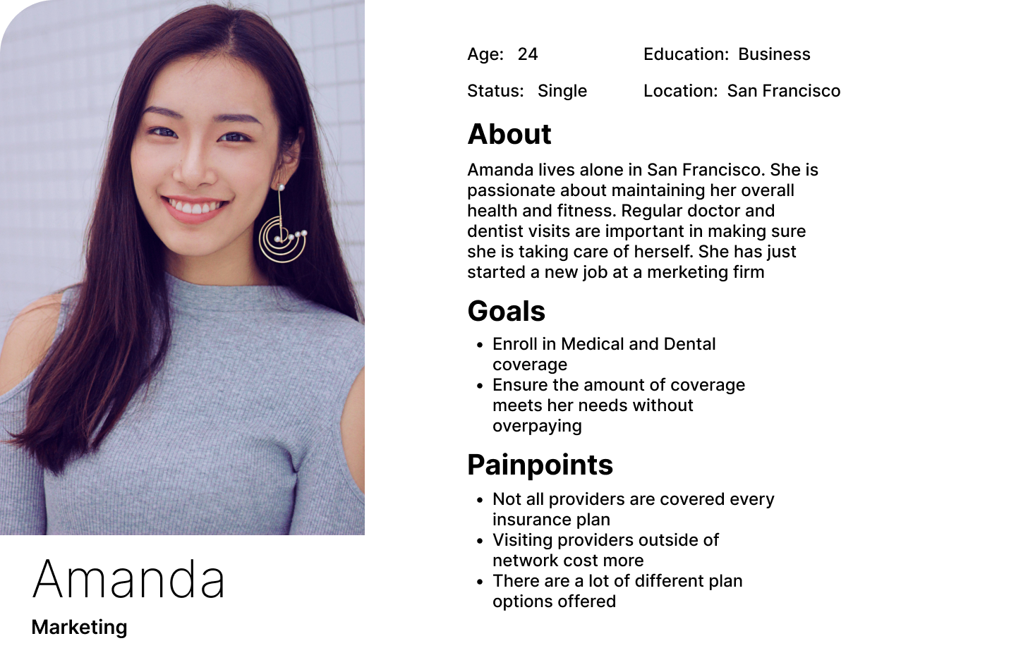
Based on our qualitative research, it was clear that some aspects of our site were hindering the enrollment experience of our users. In order to address this, I used personas I created to reign in the scope of the problem at hand and further define how this process affected the user’s flow through enrollment.
So what was the problem? The users we observed expressed difficulty in searching for and adding providers they already see. This caused friction when trying to narrow down which Insurance plans they may choose from to ensure their current providers were covered.
Primary action button switching between adding and searching providers was un-intuitive
Updating search parameters utilized a popover creating an unintuitive and inaccessible experience
Design & Build
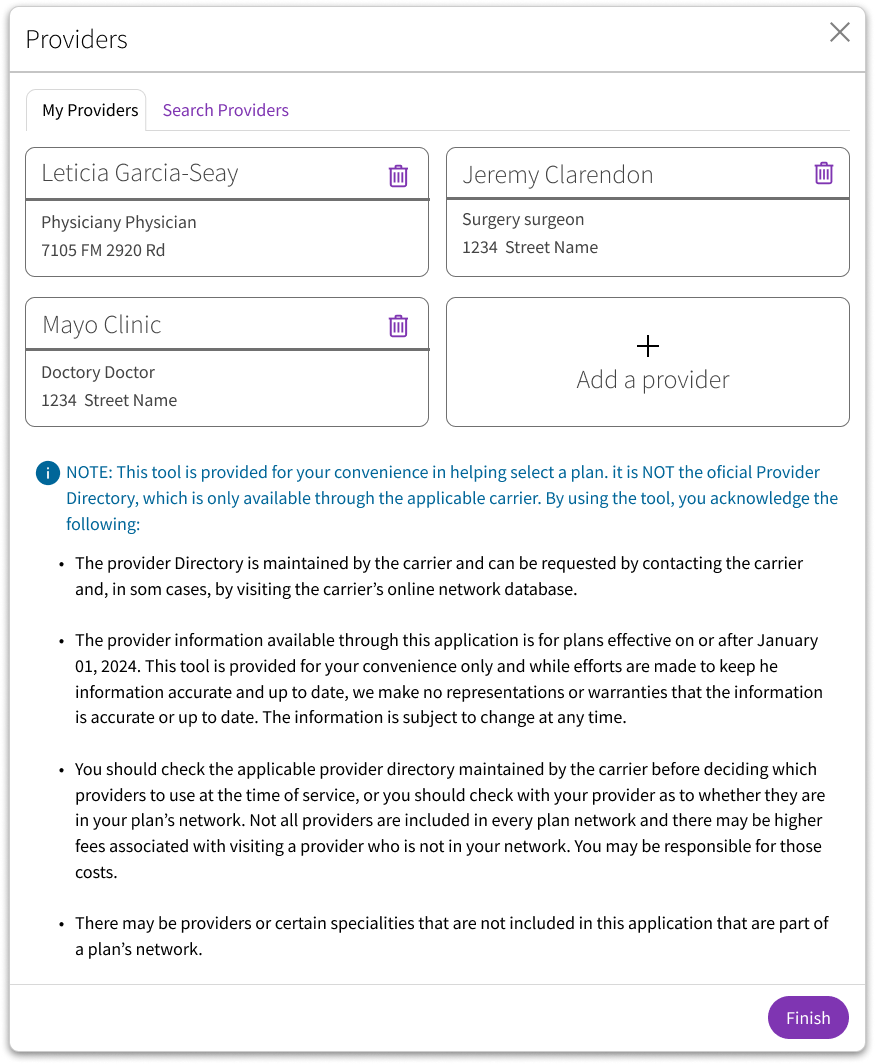
My top priority with this redesign was to improve the action of adding or removing a provider in a way that was much more intuitive for the user. This would allow them to ensure they were selecting a plan that was accepted by their providers allowing them to choose the perfect plan based on their insurance needs. This updated design was done using a branded component library to create an experience consistent with the rest of the product.
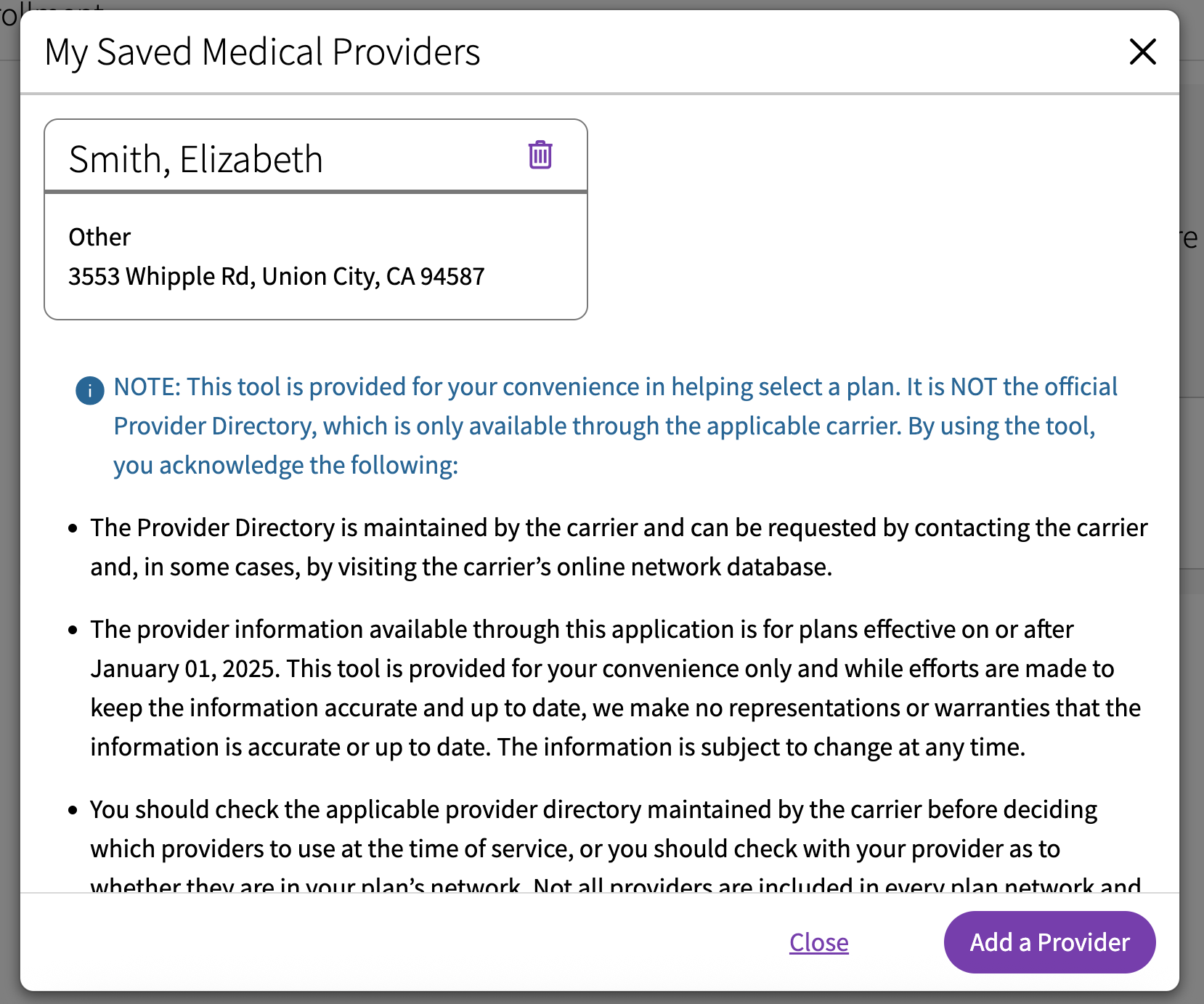
- The modal title was changed to “Providers” on both screens of the modal flow to create a more cohesive interaction
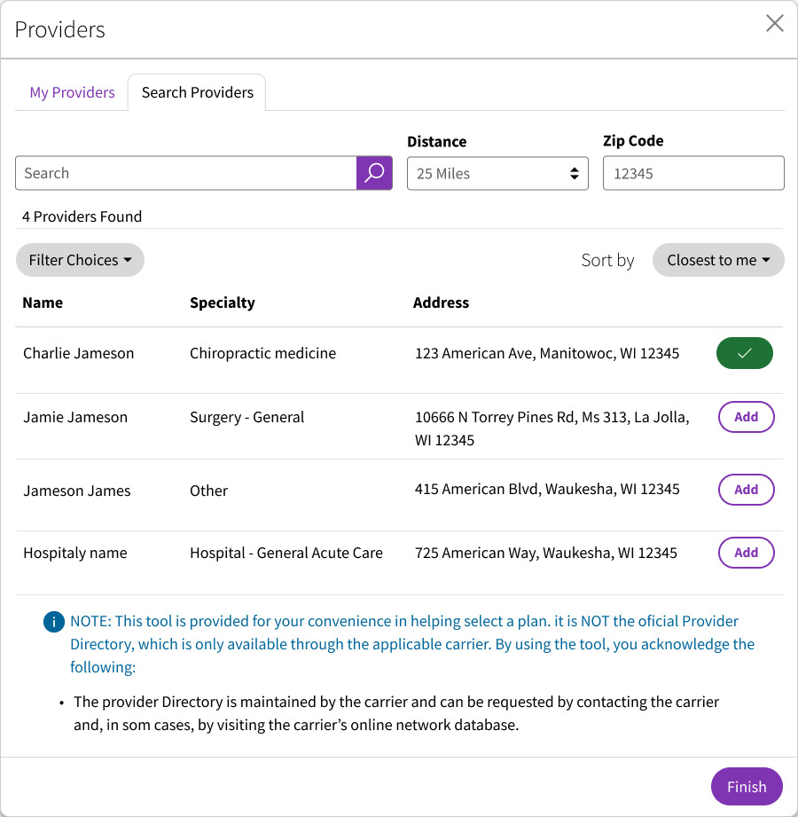
- I used a tab layout to switch between the list of existing providers and search for providers to create improving the user’s ability to compare the two lists
- Added a new “Add a provider” button under “My Providers” tab
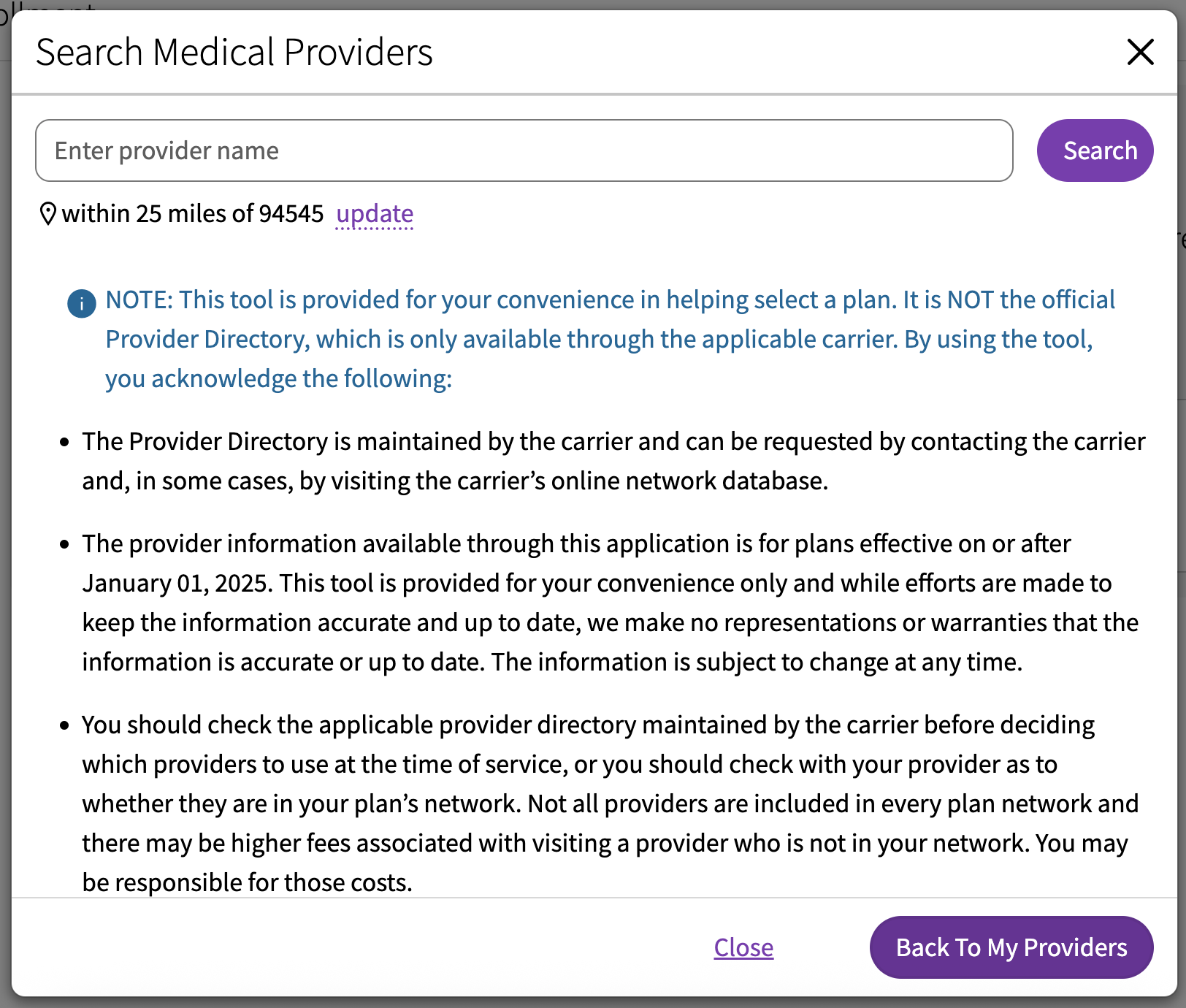
- Search results were reorganized to allow the user to scan search results more quickly
- Zip code and search radius were pulled out of the popup to improve screen reader accessibility and allow the user to more easily adjust their search parameters
- The primary action button was changed to "Finish" to give the user a more definitive way to complete the process of adding a provider
Evaluation
With this updated design, I performed evaluative research with unmoderated user testing. I ran 15 users through a set of tasks utilizing an interactive prototype I created in Figma. These results were then presented to both the UX team and stakeholders to further validate the design solution and address any concerns that may arise. The final step was presenting the design solution to my cross functional development team and fully implement the design into our product while addressing any system limitations that may arise during implementation.
Results
- 100% of users were able to successfully navigate to the Provider search and search for a new provider
- 93% of users were able to navigate back to their list of providers before returning to enrollment
- 100% of users were able to return to enrollment after successfully adding new providers to their list
Some Challenges
During the process of creating this design solution, I had to adhere to the current WCAG guidelines. These were new guidelines for our team to design within and required a lot of learning both on the design side and the development side. It was an important learning experience for both myself and my development team that required patience and communication for us to successfully implement this design solution.
Riley_Nilsen
Work
About
WTW - ESS Next
Designing to enhance the user's benefits enrollment experience
Overview
WTW provides software solutions within multiple industries, ranging from Risk management & Finance, to HR. My time at WTW was spent designing and improving a Benefits Enrollment software called ESS Next. This product serviced 3.5 million users annually across 80+ fortune 500 clients and was utilized to distribute the benefits each client offered to their employees. This was a white label product designed to encompass all possible benefits offered, allowing clients to choose which features fit their needs. In order to improve this product, I worked collaboratively on a team with 5 other UX designers to address both Stakeholder and Client needs while creating user centered design solutions.
Responsibilities
Visual design
Accessible design
Qualitative research
Evaluative research
Prototyping
Stakeholder relations
Team
4 Stakeholders
2 Project Managers
1 Product Owner
3 Developers
3 Quality Analysts
1 Business Analyst
Tools
Figma
Azure Dev Ops
Userlytics
Design Cycle
To consistently create impactful design solutions, I followed a UX design cycle established by our UX Team. This allowed me to create designs born around the needs of our users and clients, while being as consistently robust as other designs implemented by the rest of the UX team. I used this process for all the projects I completed at WTW, be it large or small.
Discover & Define
Discover the requirements and needs of the users. Define scope of the story and how to meet the user's needs.
Design & Build
Design and build a solution using WTW design system. Conduct usability testing to test design solution.
Evaluate
Conduct usability testing on design solution. Present solution and usability testing to UX Team and stakeholders for feedback before implementation.
Provider Search
Our UX Team was working to continuosly improve ESS Next. One major pain point encountered by our users was difficulty in searching for and adding existing providers. This feature was intended to help the user find insurance plans that covered their existing providers to prevent them from paying extra when receiving medical or dental care. Improving this interaction would reduce the amount of users calling the service center and decrease the overall time of enrollment from start to finish.
Discover & Define
Discover
To continuously improve our site in a way meaningful to our users, my UX Team conducted moderated and scripted, qualitative usability testing in partnership with our clients. We would test with 10 - 20 users as they went through their entire benefits enrollment process. This allowed us to sit with real users of our product and gauge whether or not our site was meeting their needs. Results from this qualitative research allowed us to define what user needs still needed to be addressed and prioritized with our product team.
Define
Based on our qualitative research, it was clear that some aspects of our site were hindering the enrollment experience of our users. In order to address this, I used personas I created to reign in the scope of the problem at hand and further define how this process affected the user’s flow through enrollment.
So what was the problem? The users we observed expressed difficulty in searching for and adding providers they already see. This caused friction when trying to narrow down which Insurance plans they may choose from to ensure their current providers were covered.
Primary action button switching between adding and searching providers was un-intuitive
Updating search parameters utilized a popover creating an unintuitive and inaccessible experience
Design & Build
My top priority with this redesign was to improve the action of adding or removing a provider in a way that was much more intuitive for the user. This would allow them to ensure they were selecting a plan that was accepted by their providers allowing them to choose the perfect plan based on their insurance needs. This updated design was done using a branded component library to create an experience consistent with the rest of the product.
- The modal title was changed to “Providers” on both screens of the modal flow to create a more cohesive interaction
- I used a tab layout to switch between the list of existing providers and search for providers to create improving the user’s ability to compare the two lists
- Added a new “Add a provider” button under “My Providers” tab
- Search results were reorganized to allow the user to scan search results more quickly
- Zip code and search radius were pulled out of the popup to improve screen reader accessibility and allow the user to more easily adjust their search parameters
- The primary action button was changed to "Finish" to give the user a more definitive way to complete the process of adding a provider
Evaluation
With this updated design, I performed evaluative research with unmoderated user testing. I ran 15 users through a set of tasks utilizing an interactive prototype I created in Figma. These results were then presented to both the UX team and stakeholders to further validate the design solution and address any concerns that may arise. The final step was presenting the design solution to my cross functional development team and fully implement the design into our product while addressing any system limitations that may arise during implementation.
Results
- 100% of users were able to successfully navigate to the Provider search and search for a new provider
- 93% of users were able to navigate back to their list of providers before returning to enrollment
- 100% of users were able to return to enrollment after successfully adding new providers to their list
Some Challenges
During the process of creating this design solution, I had to adhere to the current WCAG guidelines. These were new guidelines for our team to design within and required a lot of learning both on the design side and the development side. It was an important learning experience for both myself and my development team that required patience and communication for us to successfully implement this design solution.
Riley_Nilsen
Work
About
WTW - ESS Next
Designing to enhance the user's benefits enrollment experience
Overview
WTW provides software solutions within multiple industries, ranging from Risk management & Finance, to HR. My time at WTW was spent designing and improving a Benefits Enrollment software called ESS Next. This product serviced 3.5 million users annually across 80+ fortune 500 clients and was utilized to distribute the benefits each client offered to their employees. This was a white label product designed to encompass all possible benefits offered, allowing clients to choose which features fit their needs. In order to improve this product, I worked collaboratively on a team with 5 other UX designers to address both Stakeholder and Client needs while creating user centered design solutions.
Responsibilities
Visual design
Accessible design
Qualitative research
Evaluative research
Prototyping
Stakeholder relations
Team
4 Stakeholders
2 Project Managers
1 Product Owner
3 Developers
3 Quality Analysts
1 Business Analyst
Tools
Figma
Azure Dev Ops
Userlytics
Design Cycle
To consistently create impactful design solutions, I followed a UX design cycle established by our UX Team. This allowed me to create designs born around the needs of our users and clients, while being as consistently robust as other designs implemented by the rest of the UX team. I used this process for all the projects I completed at WTW, be it large or small.
Discover & Define
Discover the requirements and needs of the users. Define scope of the story and how to meet the user's needs.
Design & Build
Design and build a solution using WTW design system.
Evaluate
Conduct usability testing on design solution. Present solution and usability testing to UX Team and stakeholders for feedback before implementation.
Provider Search
Our UX Team worked to continuously improve ESS Next. The goal of this continuous improvement was to keep ESS Next at the top of the Benefits Enrollment market and retain clients by constantly addressing both our users and client specific enrollment needs.
One major pain point encountered by our users was difficulty in searching for and adding existing providers. This feature was intended to help the user find insurance plans that covered their existing providers to prevent them from overpaying for medical or dental care. Improving this interaction would reduce the amount of users calling the service center and decrease the overall time of enrollment from start to finish.
Discover & Define
Discover
To continuously improve our site in a way meaningful to our users, my UX Team conducted moderated and scripted, qualitative usability testing in partnership with our clients. We would test with 10 - 20 users as they went through their entire benefits enrollment process. This allowed us to sit with real users of our product and gauge whether or not our site was meeting their needs. Results from this qualitative research allowed us to define what user needs still needed to be addressed and prioritized with our product team.
Define
Based on our qualitative research, it was clear that some aspects of our site were hindering the enrollment experience of our users. In order to address this, I used personas I created to reign in the scope of the problem at hand and further define how this process affected the user’s flow through enrollment.
So what was the problem? The users we observed expressed difficulty in searching for and adding providers they already see. This caused friction when trying to narrow down which Insurance plans they may choose from to ensure their current providers were covered.
Primary action button switching between adding and searching providers was un-intuitive
Updating search parameters utilized a popover creating an unintuitive and inaccessible experience
Design & Build
My top priority with this redesign was to improve the action of adding or removing a provider in a way that was much more intuitive for the user. This would allow them to ensure they were selecting a plan that was accepted by their providers allowing them to choose the perfect plan based on their insurance needs. This updated design was done using a branded component library to create an experience consistent with the rest of the product.
- The modal title was changed to “Providers” on both screens of the modal flow to create a more cohesive interaction
- I used a tab layout to switch between the list of existing providers and search for providers to create improving the user’s ability to compare the two lists
- Added a new “Add a provider” button under “My Providers” tab
- Search results were reorganized to allow the user to scan search results more quickly
- Zip code and search radius were pulled out of the popup to improve screen reader accessibility and allow the user to more easily adjust their search parameters
- The primary action button was changed to "Finish" to give the user a more definitive way to complete the process of adding a provider
Evaluation
With this updated design, I performed evaluative research with unmoderated user testing. I ran 15 users through a set of tasks utilizing an interactive prototype I created in Figma. These results were then presented to both the UX team and stakeholders to further validate the design solution and address any concerns that may arise. The final step was presenting the design solution to my cross functional development team and fully implement the design into our product while addressing any system limitations that may arise during implementation.
Results
- 100% of users were able to successfully navigate to the Provider search and search for a new provider
- 93% of users were able to navigate back to their list of providers before returning to enrollment
- 100% of users were able to return to enrollment after successfully adding new providers to their list
Some Challenges
During the process of creating this design solution, I had to adhere to the current WCAG guidelines. These were new guidelines for our team to design within and required a lot of learning both on the design side and the development side. It was an important learning experience for both myself and my development team that required patience and communication for us to successfully implement this design solution.